
Give Users Design Powers With Drupal's Color Field Module

Aaron Silber

Giving your editors the ability to select colors in different areas of your interface can be a very attractive feature. Unique backgrounds, borders, and text colors can give organizations newfound flexibility in how they create digital experiences.
The Color Field module for Drupal 8 defines a simple field that allows users to select a color through a number of configurable display widgets and allows developers to display the color through a special "Color CSS declaration" formatter which writes a block of CSS to the page. Let's jump right in — time for a walk-through!
Use Case: Article Teaser Variants
Let's assume you need to build a component for article teasers, and the designer has identified sensible opportunities to alter the colors of the teaser in various places throughout the site. Here are a few examples of how those teasers may look throughout the site.
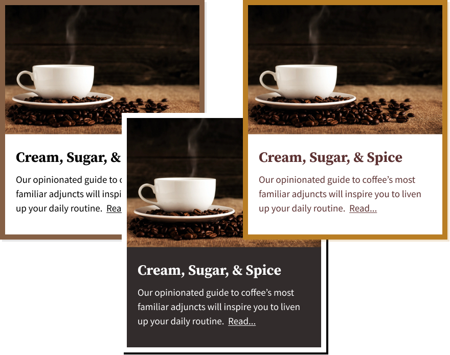
Photo by Mike Kenneally on Unsplash
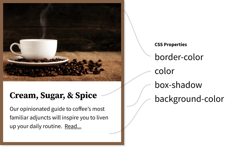
You'll notice that the differences between these variants boil down to color. Here are the CSS properties we want editors to be able to influence.
Configure Color Fields
For the simple purposes of this walk-through, we'll assume that we've created a "Teaser Card" custom block type with fields for an image, title, abstract, and link. We'll be adding fields that allow editors to change the appearance of specific instances of this block.
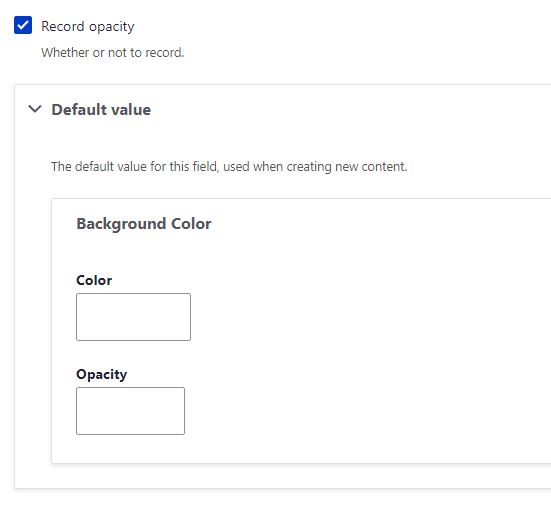
We'll head on over to our custom block type and add a 'Border Color' field using the 'Color' field type.
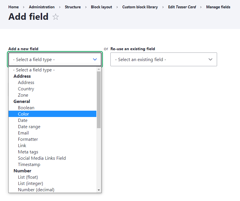
We'll save the field settings with their defaults.
The Color field allows us to disable opacity, but we enjoy the flexibility, so we'll keep it as well. We have no need for default values at this time.
In our example, you'd also add fields for Text Color, Box Shadow Color, and Background Color.
Manage the Form Display
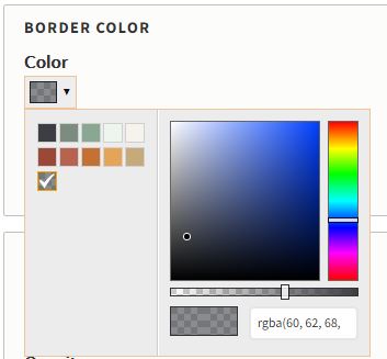
Several widgets are available for the form display of color fields, but the "Color spectrum" widget is our favorite. We like to configure a color palette using the site's brand colors here.
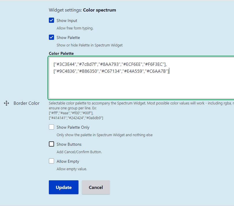
The color palette anchors editors' decisions and gives them a way to ensure their choices are on-brand when needed.
Theme our Custom Block
In order to manage the display of our color field values as CSS declarations, we need to ensure that our custom block has a unique ID attribute value.
<article class="article article--teaser" id="block-{{ elements.content['#block_content'].id() }}">
  <div class="article__media">
    {{ teaser-image }}
  </div>
  <div class="article__content">
    {{ content }}
  </div>
</article>
We'll configure the color field to inject CSS style blocks to the head of the page with matching selectors in the next step.
Manage the Display
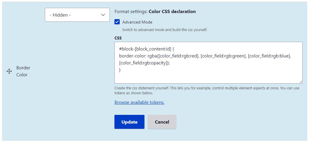
By default, the "Color CSS declaration" formatter allows us to configure a selector and choose either a "Background color" or a "Text color" property.
However, an optional "Advanced Mode" checkbox allows us to write our own CSS declarations from scratch, using tokens to insert the color values from the field. This is really powerful!
This results in a block of CSS being added to the head of the page.
<style>#block-81 { border-color: rgb(138,167,147); }</style>
Not only does this keep inline-css out of your markup, you may also target children, siblings, and psuedo elements like first-line, first-letter, before, and after that would normally be out-of-reach using inline styling theme modifications.
Completing configuration for our article teasers may result in CSS that looks like this;
#block-81 {
  border-color: rgb(138,167,147);
  box-shadow: 4px 4px 0px rgba(138,167,147,0.4);
}

#block-81 .article__content {
  color: rgb(0,0,0);
  background: rgb(255,255,255);
}
Paired with modules like the Background Images Formatter, this approach to theme modification has allowed us to put some well-defined design powers back into the hands of editors. We hope it inspires you too!

Aaron Silber
Our resident digital polymath, Aaron shares a wide knowledge of how products and services are designed and built for the web.
Keep Reading
Is Your Security Built Into Your Operations or Added On Later?
Omni Strategic Technologies
Security issues rarely start with something big. They build quietly. Our new blog post breaks down how this happens and what changes when security is built into how your business runs.
Are You Getting Full Value From Your Tools?
Omni Strategic Technologies
Just because you’re paying for the software doesn’t mean you’re getting full value. For many businesses, features sit unused, workarounds take over and subscriptions renew without a second thought. Our latest blog shows where value slips and how to spot it.

Automation Shortcuts That Save Time and Money
Omni Strategic Technologies
Automation often gets positioned as complex and expensive. In practice, the biggest automation wins usually come from removing the small, repetitive tasks that slow your team down every day.